Juxtaposition means to place 2 things side by side to compare their differences. What does this have to do with miiverse revival? Does it mean how Nintendo failed and pretendo prevailed?
The original idea of Juxtaposition was to juxtapose Miiverse by reimagining what it could look like in the modern day. That’s why the design is purposefully different from many other Miiverse clones that attempt to replicate the original Miiverse UI.
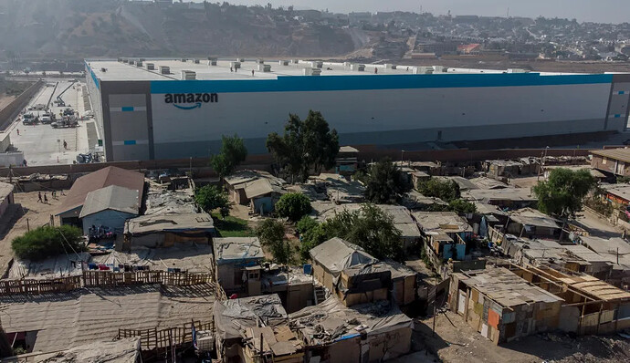
The term “juxtaposition” can be boiled down to one main concept: contradiction/extreme opposites. What you’ve mentioned is the literal dictionary definition, which is commonly used in things like advertising or other visual media. A good example would be like the movie The Godfather where the baptism scene juxtaposes the rest of the otherwise graphic movie. Another example I see a lot is wealth vs poverty, such as these famous images of Amazon warehouses being installed in poor communities. The wealth of Amazon juxtaposes the reality of the poor communities they’re in:
but these are literal/visual examples. Juxtaposition is also a powerful literary tool. It’s purpose in both forms of media is the same: to create a contrast between two things to highlight their differences, and in doing so shed deeper light on both sides
Some great literary examples of juxtaposition can be found in books such as Animal Farm and The Great Gatsby. In Animal Farm the animals seek equality and revolution, however the eventual corruption of the pigs contradict the initial message. The famous line “all animals are equal, but some animals are more equal than others” highlights the juxtaposition between the two ideals. In The Great Gatsby the parties that Gatsby throws are very extravagant and the book goes into detail about how fancy they are and how this shows off the wealth of Gatsby. However you learn that Gatsby is incredibly lonely and unfulfilled. The emotions Gatsby feels in secret juxtapose the previously shown extravagance, and highlights how material wealth does not always lead to happiness
We borrow the word “juxtaposition” for our service’s name because it, at least initially, serves the same purpose. It is meant to juxtapose both the original Miiverse and other clones which came before, and after, us. Juxtaposition is not intended to be just another Miiverse clone, trying to recreate how Miiverse felt originally. It’s intended to be a modern take on the concept, as if Nintendo made Miiverse today rather than 13 years ago. This was a driving motivation for things like the design direction and feature set. We intentionally did not use the original Miiverse design because of this, and we plan to add new features as well. We do this to highlight the differences between our services, while still paying homage to the original in some aspects
However in recent times we’ve strayed away from this. Jemma, the lead Miiverse dev, started to want to make Juxtaposition look/feel more like a standard Wii U/3DS app, and many others did as well. So the design started to shift away from the original goal. However I believe this to be a mistake, and I do plan to correct it in the future and go back towards a more modern look as it was originally intended
That being said, I do understand the desire for a more “classic” feeling UI, and so internally I’ve proposed the idea of just introducing multiple themes. The default being the modern UI, and then allowing for a “classic” theme which looks more like a standard Wii U/3DS app. For the best of both worlds
